
I decided to make a throw quilt to cuddle up with on the couch, so I didn't want it to be too big but still big enough to wrap up in (the finished size ended up being 67" x 54").

This is the first fabric pull I did for my quilt... and I felt like a little something was missing. So, I took out a couple of the low volume prints and added some darker prints that I thought would work well with the purple. I used a lot of different fabrics in this quilt top, including lines from Carolyn Friedlander, Lizzy House, Lotta Jansdotter and Denyse Schmidt- some of my favorite designers.
Once I settled on the colors, I cut out around 200 5" squares.

Hind sight is ALWAYS 20/20 and I wish I would have used a proper pattern for this quilt! Instead, I just decided to wing it, as I always do. Which ended up just fine but I think using an actual pattern would really ensure that you cut just enough fabric that you need... instead of ending up with a square or two less of a certain print that you really wanted to repeat in the quilt! (Click here for a tutorial from Jeni of In Color Order. I [obviously] didn't use the tutorial so I can't personally endorse it but Jeni's tutorials and patterns are always spot on!)
I pieced this quilt top together a little over a week ago at a girls sewing weekend and am so pleased with the way it turned out!!!
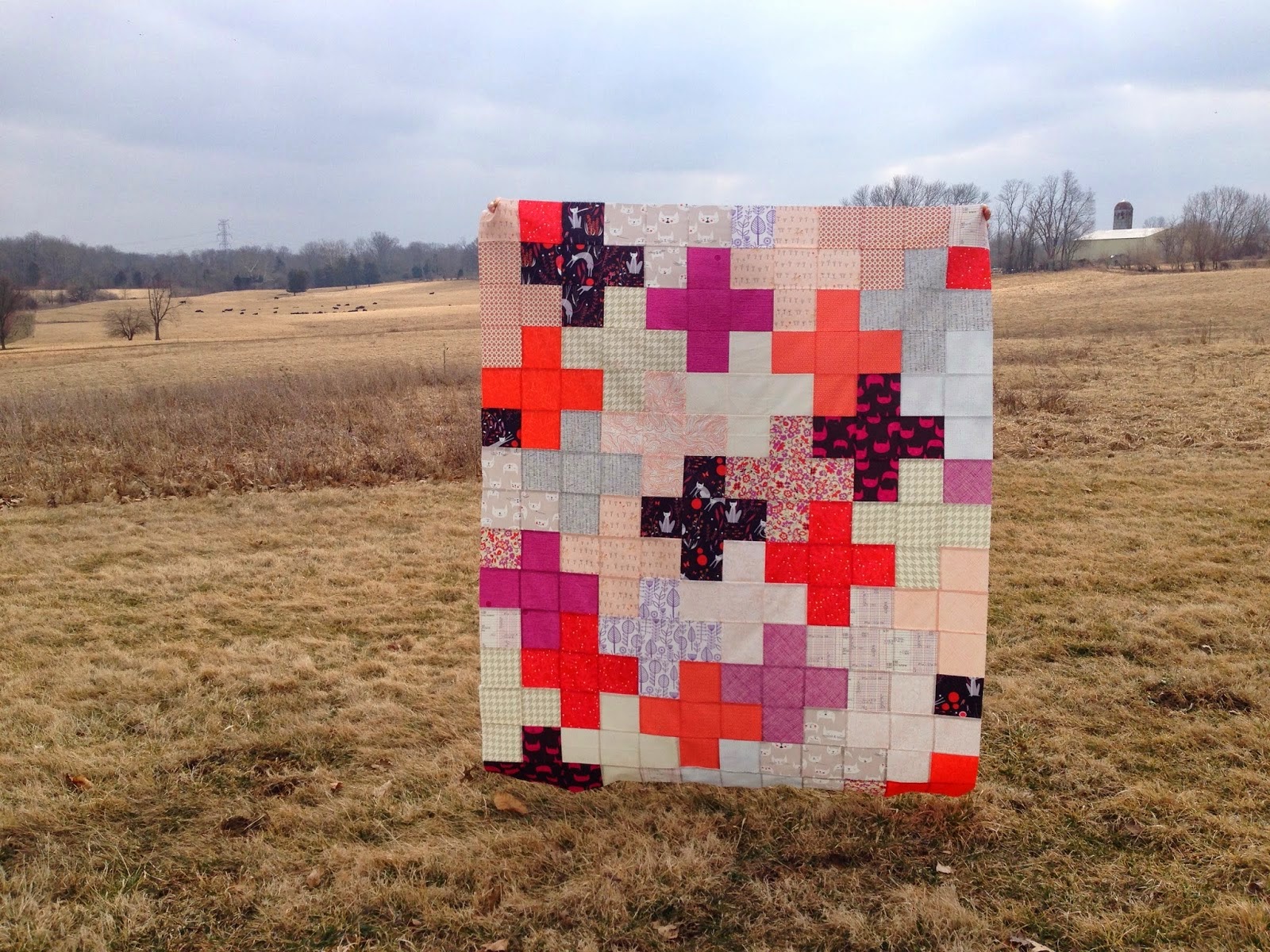
I really love the way the different shades of purple are highlighted in this quilt; they're very dominant but because of the other shades they are paired with, I think you don't have to be a big purple lover to like this top. I never thought I'd say this, but I'm kind of seeing how purple can be used as a neutral... who am I?! ;)
Radiant Orchid has SERIOUSLY gotten me out of my sewing comfort zone and I LOVE it! I'm kind of already excited to see what Pantone's color is for next year... :)


I love the red/orange color in with the purples. Really a stunning quilt top!
ReplyDeleteVery pretty. I love the contrast.
ReplyDeleteWhoa Kara - I love the colours you've used, and the design (and those are some of my fave fabrics too). I might have to stock up on catnap! Thanks so much for playing along with the Pantone Quilt Challenge!
ReplyDeleteKara, your quilt is stunning. I'm drooling over your fabric choices and adore that you added that pop of orange amongst the Radiant Orchid fabrics. Love it!
ReplyDeleteI just voted for your pillow in the contest. Really nice choice of fabrics! The funnest part is finding your blog! I've added it to my Bloglovin' list. Good luck!
ReplyDeleteGuh, that coral red slays me. I never would have thought to pair it with purple but it is GORGEOUS!! And then you throw in the creams, peaches and that deep violet and it comes together to make pure, unadulterated awesomesauce.
ReplyDeleteLOVE this. (In case that wasn't obvious.)